

How can we test buttons on a UI? In what ways can we approach our testing? In this post, I’d like to share some things for the curious mind to consider when testing buttons on a front-end/user interface.
We were recently testing a feature which is going to be rolled out to every user on our platform via a notification. In doing so, our team found an issue with one of the buttons shown to the end user (shown below:)
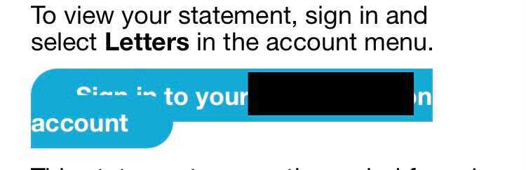
Luckily the error was fixed before deployment, but finding it inspired this post. As we know, buttons can behave in countless ways on a page, so apologies in advance for the fact that this blog will only scrape the surface of what is a huge subject. Nonetheless, I thought it would be a good idea to share some tips and things to bear in mind if you’re testing buttons on the front end of an application – and I hope you’ll find them useful.
1. How does it look? The first thing the user does with a button is look at it – so let's consider the following:
- How much text is on the button? If there's quite a lengthy sentence or call to action, could that cause some issues in relation to page responsiveness, as shown above? Additionally, is the font used compatible on other browsers, including older ones?
- Is the colour of the button consistent with the other aspects of the application? If it is, that might not necessarily be a good thing. Does the button call the user to an important action – for example, if it is missed could their account be affected? If so, then maybe the colour should be something contrasting that grabs the reader’s attention and suggests 'click me NOW' in tone (in red or orange, say) as opposed to a more casual 'hey there, why not click?' (if consistent with the usual colours of the application). Alternatively, if the application already uses red or orange colours in its branding, you’ll probably need to use an alternative colour to make the text stand out – something to think about.
- Does it animate? When you hover over it, does your mouse cursor icon change? Does the button animate when you click on it? If so, you’ll need to start considering how this button will behave on mobile devices, where there is no mouse icon. You’ll also need to think about what will happen with other or older browsers, because the animations may only work on modern browsers.
2. What does it do? We can now start thinking about how the button behaves. For example, is it a button that submits data? Can it be held down to increase the value in increments (like a counter button)? If so, how would this work on other devices? Does it take us to the correct place when it is clicked on? Is it dependent on mandatory fields? If any of those are the case, we should check that the button works and submits information provided when those fields both are and are not filled with data.
- Where is it all happening?
OFF the page: When we interact with the button, we can open our browser dev tools to monitor if there is any activity in the 'network' tab. If so, we can now open to a whole new world of opportunities (API testing, for example). Can we manipulate the HTTP traffic? (An excellent post/video on how to do this, by The Evil Tester, can be found HERE). Perhaps block the request to see how our application behaves in the absence of icons and/or buttons. When we view the requests allowed, should we be able to perform each one? (For example, if it accepts a ‘delete’ request, you may want to question why.)
ON the page: Alternatively, if we click the button and there is no network traffic, we can then start thinking about possibilities in relation to CSS and Javascript, since the behaviour is happening on the page only. Do new fields open up? If so, do we have an option to go back and close those fields? What happens if we keep going back and reopening those fields? Do they just keep reopening down the page in a never-ending chain? Should they only open up once? You should also check this behaviour on various browsers and devices.
There are so many different things that can happen on the page when interacting with buttons but, generally speaking, the main things we will probably have to consider in this instance will be compatibility (with other browsers and operating systems) and the performance of the site. Bear in mind that if we have a lot of stuff happening on the page once the button is clicked, we probably have large files stored, and they can slow performance, from as soon as when the site loads as it is first visited.
ON AND OFF the page: Here’s something else to consider. If we are shown a message of some sort on the front end after clicking the button, does that message correctly coincide with what is happening in the back end? For example, you may get the message 'user successfully created' – but then find, when you check the back end, that there is no user, and vice-versa (reconciling front end and back end behaviours). It’s always worth double-checking.
3. Can and should we automate this? Does the introduction of the button create more work flows? Is the same button used in several places with the same function? If so, perhaps we could save ourselves some time by automating the clicking or hovering of this button, by verifying that it looks and behaves as we expect, or by automating the filling of data it requires.
Allow me to briefly mention a project I once tested. It was a tool for doctors and healthcare professionals to use to register patients with a specific condition. It wasn’t your normal user creation form, and instead had many tabs containing mandatory fields. I couldn’t get to the next tab on the user creation form until those mandatory fields were filled in on each specific tab (confused yet?!). We had one button at the end of each form, which was used across five different tabs, and, when clicked, opened up a text box requiring more details before you could move to the next tab. Obviously this was very time-consuming – it would take approximately five or six minutes just to create one user. Automating this process seemed to be a natural thing to consider at the time. Whenever I needed to create a new user on the system, it was made a lot more simple and easy via the automated tests we created. OK, this example isn't button-specific, but it does show that there are things we can automate on the button itself, such as left clicks, right clicks and mouse hovers.
It’s something to consider when testing front end buttons. Bear in mind, though, that just because you can automate it, doesn't necessarily mean you should.
4. Who can use this? What’s the demographic of your users? Do you know? (You should!) Is this button going to be equally usable for those users? Does it use clear text at a good size? Is the colour easy on the eye for those who have difficulty seeing? Can we use an alternative way of doing what the button is doing if the button doesn't work on older browsers or other devices? These are all important things to bear in mind, and it is all too easy to overlook them.
As I have mentioned above, the possibilities are endless when it comes to testing buttons on the front end. It is likely that you wouldn’t ever just test a button in isolation. They are usually brought in along with another page or field, so when testing you should also bear in mind how these components are going to work together.
That's all for now and I hope you’ll find this post beneficial. Do please do let me know what I've missed and what you’d add to the list of things to consider when testing buttons on the front end in general.
Looking forward to hearing from you!


